
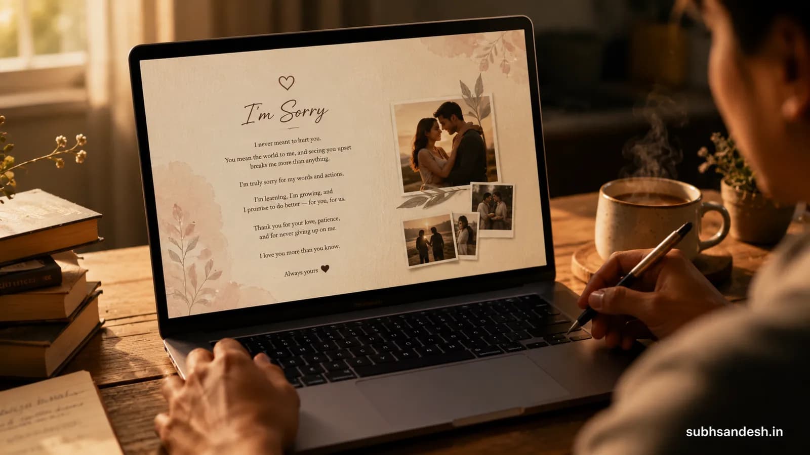
Aesthetic Clean Typography Layout for Serious Apology Notes
Learn how to design an aesthetic, clean typography layout for writing long serious apology notes that feels sincere, readable and respectful. Step-by-step choices for fonts, spacing, color, rhythm, and a simple build path so you can publish a shareable apology page fast.
Key takeaways
- • A clean, serif-led headline with a generous readable body (18–20px on mobile, 20–22px desktop) makes long apology notes feel thoughtful and respectful.
- • Control line length (50–70 characters) and 1.4–1.6 line-height to keep long sincere passages easy to read without looking cramped.
- • Soft high-contrast color palettes (muted charcoal on warm off-white) and generous margins calm the reader and emphasize sincerity.
- • Break long apologies into short paragraphs, clear subheadings, and occasional italic emphasis to preserve pace and show emotional clarity.
- • You can build this exact layout and publish a private, shareable apology page in minutes on SubhSandesh using a clean template and a few simple edits.
On this page
Yes — you can design an aesthetic clean typography layout for writing long serious apology notes that reads like a sincere, measured conversation rather than a crowded wall of text. This guide gives exact font choices, spacing rules, color palettes and an easy step-by-step build path so your apology page looks calm, respectful and truly readable.
Why typography matters for a serious apology
Typography is the emotional subtext of a note. A cramped tiny font, heavy display type or bright color can make even the most heartfelt words feel defensive or theatrical. When you're writing a long serious apology, typography should do three things: make the message effortless to read, reflect humility and create a quiet atmosphere where accountability can land.
Think of type as tone-of-voice: a soft-serif headline signals warmth; a neutral sans-serif body signals clarity. Combined with rhythm and white space, those choices let your words be heard.
Core principles: what to get right first
Keep it calm and readable
- Choose legible sizes: roughly 18–20px body text on mobile, 20–22px on desktop. Larger text reduces strain for dense passages.
- Line-height should be 1.4–1.6 to avoid crowding.
- Limit line length to 50–70 characters per line for comfortable eye movement.
Respectful contrast and color
- Prefer warm off-white backgrounds over stark white.
- Use charcoal (#222–#333) instead of pure black for main text.
- Reserve a single muted accent (sage, slate blue, warm terracotta) for links or small highlights.
Simplicity over ornament
- Avoid heavy display or script fonts for core text.
- Use italics or a medium weight sparingly to emphasize remorse or a promise without dramatizing it.
- Keep decorative elements minimal — a thin divider or a muted icon is enough.
Exact typography recipe (fonts, sizes, spacing)
Headline (opening line)
- Font: humanist serif (Merriweather, Georgia, or Playfair Display for a slightly higher contrast look).
- Size: 28–36px (desktop), 22–26px (mobile).
- Weight: 500–700 depending on the font.
- Spacing: 0.02–0.04em letter-spacing, keep it compact but not tight.
Subheadings (section labels)
- Font: same family as headline or neutral sans (Inter, Roboto).
- Size: 18–22px desktop.
- Weight: 500.
Body text
- Font: neutral sans-serif (Inter, Roboto, system UI).
- Size: 20–22px desktop; 18–20px mobile.
- Line-height: 1.45.
- Paragraph spacing: add 10–16px margin-bottom to let the reader pause.
Emphasis and quotes
- Italics for brief emphasis; avoid bolding long passages.
- Pull quotes can use the serif headline with a slightly reduced contrast to call out the most sincere phrase.
A simple layout to follow (structure and rhythm)
- Brief opening line (1–2 sentences): acknowledge and name the harm.
- What happened (short labeled section): factual and concise.
- What I understand now (short labeled section): show perspective.
- What I will do differently (actionable commitments).
- A short closing statement and clear next step (invitation to talk or time to reflect).
Numbered steps like these help long notes feel organized and intentional rather than rambling.
Step-by-step: build the layout in minutes
Below is a simple, practical build path you can follow whether you’re live-publishing or creating a private page.
- Pick a clean template (one with a single column, generous margins and minimal header).
- Choose your headline serif and body sans pair.
- Paste your note and split it into the five structural sections above.
- Adjust body size and line-height to the recommended values.
- Set background to a warm off-white and text to charcoal.
- Add a single honest photo if you want (optional).
- Preview on mobile and desktop; make final tone edits.
- Publish privately and send the link when ready.
These same steps map directly to publishing on SubhSandesh — choose a minimal template (for example an apology template like the apology page for a girlfriend or the apology page for a friend), edit your text, and share a single private link.
Typography comparison table: quick reference
| Element | Recommended font | Size (desktop) | Line-height | Purpose |
|---|---|---|---|---|
| Headline | Merriweather / Georgia | 28–36px | 1.15 | Warm, sincere opening |
| Subheading | Inter / Roboto | 18–22px | 1.25 | Clear labels for sections |
| Body | Inter / Roboto | 20–22px | 1.45 | Long-form readability |
| Accent | Merriweather Italic | same as body | N/A | Short emphasis or pull-quote |
Use this table as a checklist while you edit. If a piece of text looks crowded in preview, increase line-height or font size rather than reducing margins.
Spacing, margins and container width
- Container width: keep the main column relatively narrow — aim for 600–700px on desktop or the 50–70 character guideline per line. Narrow columns make long notes feel intimate.
- Margins: generous top and bottom padding (40–60px) frame the note and allow breathing room for the reader.
- White-space: insert a small visual divider (thin rule or a 1px soft gradient) between sections rather than long blocks of dense text.
Visual tone: color, imagery and media
- Color: warm off-white (#FCF8F3) with charcoal text (#222). Accent color can be muted slate (#7A8B8F) or soft sage (#8A9E93).
- Imagery: keep to one honest photo (a neutral portrait or a small symbolic image like two hands). Avoid staged, smiling photos.
- Music: if you add audio, choose a quiet instrumental track under 30 seconds and give the reader mute control. Silence is often kinder.
Language and copy tips to pair with your layout
Typography sets the stage; words do the repair. Use short declarative sentences for responsibility. Avoid conditional language that shifts blame ("if you were hurt...)." Instead use statements like "I was wrong about..." and concrete commitments: "I will..."
Keep paragraphs short. Each paragraph should have a single idea: an acknowledgment, an explanation (not an excuse), an understanding and an action.
Accessibility considerations
- Contrast: ensure text contrast meets WCAG AA (charcoal on warm off-white usually works).
- Scannability: use semantic headings so screen readers can navigate the apology sections.
- Text resizing: confirm the layout remains readable when text is increased by 20–30%.
Example: short visual mock of the opening
- Headline (Merriweather, 34px): "I'm Sorry — I Let You Down"
- Subheading (Inter, 20px): "What I did"
- Body (Inter, 20px, 1.45): two short paragraphs acknowledging the action and impact.
This combination signals a steady, human apology rather than an emotional outburst.
Real editing checklist before you publish
- Read the note aloud once to spot tone problems.
- Ensure each paragraph has one idea.
- Replace vague promises with specific actions (dates or behaviors if appropriate).
- Remove blaming language and explanations that begin with "if" or "but."
- Preview on mobile; check spacing and font scale.
Quick comparison: aesthetic vs dramatic apology designs
- Aesthetic/clean: narrow column, large readable type, soft colors, clear sections — communicates steadiness and respect.
- Dramatic: heavy display fonts, tight spacing, dark backgrounds, ornamental flourishes — can feel performative and distract from accountability.
Choose the aesthetic/clean route when the goal is sincere repair and a respectful space for reading.
Where to publish a private apology page (fast, no design skill required)
If you want to publish a private apology page without learning design or code, SubhSandesh offers templates tailored to personal moments. Pick a clean template, paste your typography choices, add a single image if you like, and publish a private link in minutes. For relationship-specific templates, look at the apology page for a girlfriend or the apology page for a friend. If you’re missing someone and want to pair the apology with a personal message, try the I miss you page for a girlfriend.
Final tone checks before sending
- Does the page read as steady and accountable rather than defensive?
- Are your commitments specific and realistic?
- Is the layout calm and easy to follow on mobile?
If the answer to those three is yes, you're ready.
How SubhSandesh makes this easy
We built SubhSandesh for moments like this. Use a clean template, choose a serif/sans pair from the settings, paste your structured sections, and the platform handles spacing, scaling and mobile preview automatically. You can keep the page private until you’re ready and share a single link when the moment feels right.
Ready to show you mean it? Create your free SubhSandesh apology page in minutes and share the private link — or browse our collection of simple templates first at https://subhsandesh.in/templates.
Short closing: your words, presented with care
An apology’s power is both what you say and how you present it. Thoughtful typography and measured layout let honesty land. Use the font sizes, spacing and structure above as a practical toolkit and let your words do the repairing. If you want a fast, design-safe way to publish that note, SubhSandesh templates are set up to make your apology feel calm, clear and sincere.
Frequently Asked Questions
Turn this inspiration into an unforgettable surprise
Build a page with photos, a heartfelt message, music and a ready-to-share link.
- Photos, message & music
- Ready-to-share link

Written by
Suyash Agrahari
Founder
Suyash Agrahari is a Software Engineer at HireQuotient and the founder of SubhSandesh and DrawFlow (drawflow.in). He builds AI agents and full-stack products with Next.js, Node.js, and the OpenAI and LangChain ecosystems, having shipped autonomous multi-agent systems, AI copilots, and large-scale outreach platforms — and scaled side projects from a few hundred to millions of users. He writes about AI engineering, web development, and building products that grow through SEO and organic reach.
Keep reading
Romantic Polaroid Filter Image Carousel Module for Couple Websites
Create a romantic polaroid-style image carousel for your couple website without coding. This guide shows you how to design the look, pick photos, add …
 Suyash Agrahari· 8 min
Cute Polaroid Stack Photo Presentation Page for Dating Anniversary
Make a cute polaroid-stack photo presentation page for your dating anniversary with a few photos, a short love note, and light motion. This guide show…
Suyash Agrahari· 7 minComplete Canvas Codebase Example for Romance Greeting Links
A practical, non-technical guide that explains the design and interaction ideas behind a complete canvas codebase example for flowing interactive roma…
Suyash Agrahari· 8 min