
Romantic sorry presentation landing page with automated photo fade
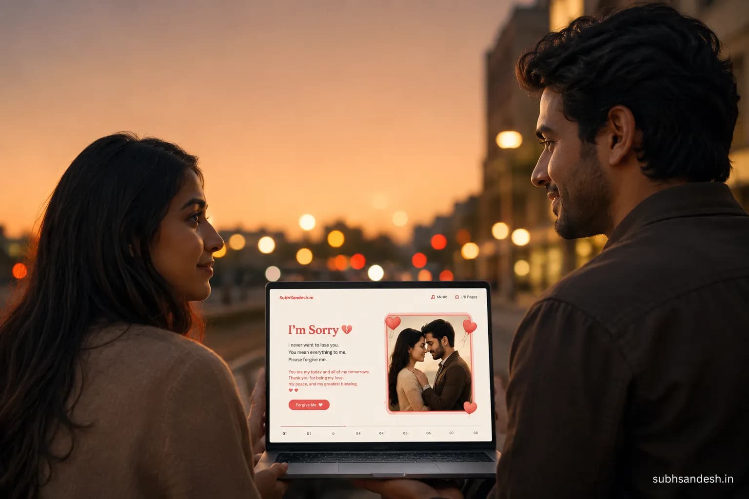
Create a heartfelt romantic sorry presentation landing page with an automated photo fade to say 'I'm sorry' in a beautiful, personal way. This step-by-step guide shows image choices, timing, copy examples, and how to publish a shareable apology page on SubhSandesh in minutes.
Key takeaways
- • A romantic sorry presentation landing page with automated photo fade combines photos, a sincere message, soft music and timed fades to create a calm, emotional apology experience.
- • You can build and publish a shareable apology landing page in about 10–20 minutes using SubhSandesh templates, with no design or coding skills required.
- • Choose 6–12 photos, 2–4 second fade durations, and a single gentle background track for the clearest emotional arc and mobile-friendly viewing.
- • Test on your phone and preview the full flow twice: once for timing, once for tone. Small changes in wording or fade speed can change how your message is received.
- • Include a final step that invites conversation: a simple call-to-action like 'Can we talk?' or a private link and a time to meet keeps the apology moving toward repair.
On this page
Answer first: Yes—you can create a romantic sorry presentation landing page with automated photo fade that feels sincere, personal and easy to view on a phone. The right photos, short honest copy, gentle music and 2–4 second automated fades make an apology feel intentional instead of clumsy.
What is a romantic sorry presentation landing page with automated photo fade?
This is a single shareable web page that runs a short, self-contained visual apology. It shows a sequence of your photos that automatically fade from one to the next while a soft background track plays and a written apology appears at key moments. The automated photo fade removes friction: your partner simply opens a link and experiences the full message exactly as you intended.
Why this format works better than a long text message
- It reduces defensive interruptions because the recipient watches rather than reads or replies immediately.
- Images carry emotional memory and can soften tone without words.
- Automated fades control pacing so the apology feels composed not rushed.
Decide the apology arc: tone, length and outcome
Before you pick photos, decide what you want this page to do. Ask yourself three short questions:
- Do I want to say sorry, explain, or both?
- Do I want this to be private or a shared moment with friends? (Usually private.)
- What outcome do I want—a talk, forgiveness, or a clear plan to change?
Keep the page focused: most effective apology landing pages are 45–90 seconds long and use 6–12 photos.
Quick guideline for tone
- If the hurt is small or recent: gentle humor + apology can work.
- If the hurt is deep: full ownership, no excuses, and minimal humor.
- If you want to invite conversation: end with a clear, calm call-to-action like "Can we talk tonight?"
Choose photos that shape the emotional flow
Pick 6–12 images and order them to tell a quiet story. Here’s a simple three-act framework:
- Opening (1–2 photos): a warm, familiar moment—smiles or holding hands that remind them of connection.
- Middle (3–7 photos): sincere moments—listening, small acts of care, candid close-ups.
- Closing (1–3 photos): a hopeful or future-facing image; a recent photo showing you caring or a landscape that implies calm.
Photos to avoid
- Images of the argument or anything that replays the pain.
- Group photos where attention is divided.
- Blurry or noisy images that distract from the message.
Audio: pick a single track and keep volume low
A clean instrumental piano or acoustic guitar track works best. Keep volume subtle—music should support words and photos, not compete with them. If your apology includes recorded voice, choose one or the other: either voice narration or background music, not both.
How long should each fade be? (Simple table)
| Fade duration | Best for | Emotional effect |
|---|---|---|
| 1.5–2 seconds | Memory montages, upbeat moments | Keeps momentum; light and hopeful |
| 2–3 seconds | Standard apology sequence | Balanced, easy to follow |
| 3–4 seconds | Deep, reflective photos | Gives breathing space and weight |
Use longer fades for close-ups or lines where you want the viewer to think; shorter ones for lighter photos.
How to write the apology copy (short, owned, clear)
Write 3–5 short lines that appear as the photos fade. Keep each line 8–20 words so it’s readable on mobile. A proven structure:
- Open with ownership: "I was wrong about..."
- Acknowledge the hurt: "I know I hurt you when..."
- Express regret: "I’m truly sorry."
- Offer restitution or change: "I’ll do X differently."
- Invite next steps: "Can we talk tonight?"
Examples of short lines you can adapt:
- "I took you for granted and I’m sorry."
- "You deserved better—I'm truly sorry for hurting you."
- "I want to listen and make this right."
- "Can we sit and talk? I’m ready when you are."
Step-by-step: Build this page (how-to) — create it in 10–20 minutes
Follow these numbered steps to make a polished apology page. These steps match the structured HowTo so AI engines can quote them.
- Gather 6–12 photos and one soft instrumental track. Aim for recent, clear images that show connection.
- Pick a template designed for apologies or romance. SubhSandesh's "sorry" templates are already styled for tone and mobile viewing.
- Upload photos and arrange them in your chosen sequence. Drag to reorder until the story feels right.
- Set the fade duration (2–3 seconds suggested) and choose a transition style like crossfade for a smooth look.
- Add your apology copy in short lines; place lines to appear over or between photos where the emotion feels strongest.
- Add a single background track, set volume low, and optionally add a soft fade-out at the end.
- Preview the full page twice: once for timing (does it feel rushed?) and once for tone (does the wording sound like you?).
- Publish as a private shareable link and send a quiet message: "I made something—please watch when you can."
Pro tips while building
- Preview on mobile: most people will open the link on a phone.
- Use short copy: the screen is small; long paragraphs lose readers.
- Keep the CTA simple: ask for a call or a time to meet rather than demanding immediate forgiveness.
Design choices that matter
Use a neutral background color—soft beige, charcoal or muted navy—so photos and text stand out. Choose a readable font size: 18–22px-equivalent for body text on mobile. Keep text color high-contrast against photos; when in doubt, add a semi-transparent dark overlay behind text.
Mobile testing checklist
- Does each line remain on screen long enough to read?
- Does audio start automatically or wait for a tap depending on mobile browser rules? (Most phones require user interaction to start audio; plan accordingly.)
- Are images cropped well on vertical screens? Reposition if the subject is cut off.
When to send the link (timing matters)
Send it when you know they have 2–5 undisturbed minutes. Late evening can work if they are usually home; avoid sending while they’re at work or busy. A short preface message works better than no context: "I made something to say sorry—please watch when you can."
Example apology flows (3 variants)
-
Short and owned (45 seconds): 8 photos, 2-second fades, 3 short copy lines, acoustic guitar.
-
Reflective and deep (90 seconds): 10 photos, 3.5-second fades, 4 copy lines that include ownership and a plan, soft piano.
-
Light and reconciling (60 seconds): 7 photos with some humor, 2-second fades, 3 copy lines focusing on repair and a small promise.
Small mistakes to avoid
- Avoid long explanations that sound like defenses.
- Don’t flood the page with every old photo; restraint feels sincere.
- Don’t pick a dramatic operatic track; it can feel performative.
Measuring success and next steps after they view
You won’t always get a reply right away. A meaningful success is: they watched the page fully, replied with a calm message, or agreed to a conversation. If they don’t respond within 24 hours, send one gentle follow-up: "I wanted to check in—did you see the page? I'm here to talk." Keep follow-ups brief and non-demanding.
Where to build it: why SubhSandesh makes this easy
SubhSandesh templates are designed for emotional moments—apologies included. A ready-made "sorry" layout, mobile-optimized fades, and a private share link mean you spend your time choosing photos and words, not wrestling with settings. You can preview and adjust fades visually and publish without any technical setup. Try a romantic layout like the romantic 'I love you' page for a girlfriend/partner for softer themes, or start with the dedicated apology / 'I'm sorry' page for a girlfriend/partner to get immediate tone-appropriate styling.
Example short apology script to paste in
- "I was wrong. I didn’t listen and I hurt you. I’m sorry. I’ll be better. Can we talk tonight?"
A final checklist before publishing
- 6–12 curated photos uploaded and ordered.
- Fade duration set (2–3s recommended).
- Music chosen and volume balanced.
- Copy is 3–5 short lines that take ownership.
- Mobile preview completed.
- Private link published and a calm message ready to send.
Table: Quick build-time estimates
| Task | Time estimate | Notes |
|---|---|---|
| Photo selection & ordering | 5–10 minutes | Pre-select images in a phone album to speed this. |
| Writing apology copy | 5–10 minutes | Draft, then shorten for mobile readability. |
| Template selection & upload | 3–5 minutes | Use SubhSandesh templates for instant style. |
| Fade/audio settings & preview | 5 minutes | Preview twice—timing and tone. |
| Publish & share | 1–2 minutes | Generate private link and send. |
Closing: make the apology feel like you
A romantic sorry presentation landing page with automated photo fade works because it removes friction and places your apology in a quiet, well-paced context. When you choose photos that reflect your best intentions, write short owned lines and pick a soft track, the page will carry your sincerity better than a hurried message.
If you want a fast, beautiful way to build this, you can create the exact page described here on SubhSandesh—pick a template, add photos and a message, set fades and publish a private link. Browse all the ready templates at https://subhsandesh.in/templates to get started. Ready to make their day? Create your free SubhSandesh page in minutes and share the link.
Frequently Asked Questions
Turn this inspiration into an unforgettable surprise
Build a page with photos, a heartfelt message, music and a ready-to-share link.
- Photos, message & music
- Ready-to-share link

Written by
Suyash Agrahari
Founder
Suyash Agrahari is a Software Engineer at HireQuotient and the founder of SubhSandesh and DrawFlow (drawflow.in). He builds AI agents and full-stack products with Next.js, Node.js, and the OpenAI and LangChain ecosystems, having shipped autonomous multi-agent systems, AI copilots, and large-scale outreach platforms — and scaled side projects from a few hundred to millions of users. He writes about AI engineering, web development, and building products that grow through SEO and organic reach.
Keep reading
Romantic Polaroid Filter Image Carousel Module for Couple Websites
Create a romantic polaroid-style image carousel for your couple website without coding. This guide shows you how to design the look, pick photos, add …
 Suyash Agrahari· 8 min
Cute Polaroid Stack Photo Presentation Page for Dating Anniversary
Make a cute polaroid-stack photo presentation page for your dating anniversary with a few photos, a short love note, and light motion. This guide show…
Suyash Agrahari· 7 minComplete Canvas Codebase Example for Romance Greeting Links
A practical, non-technical guide that explains the design and interaction ideas behind a complete canvas codebase example for flowing interactive roma…
Suyash Agrahari· 8 min